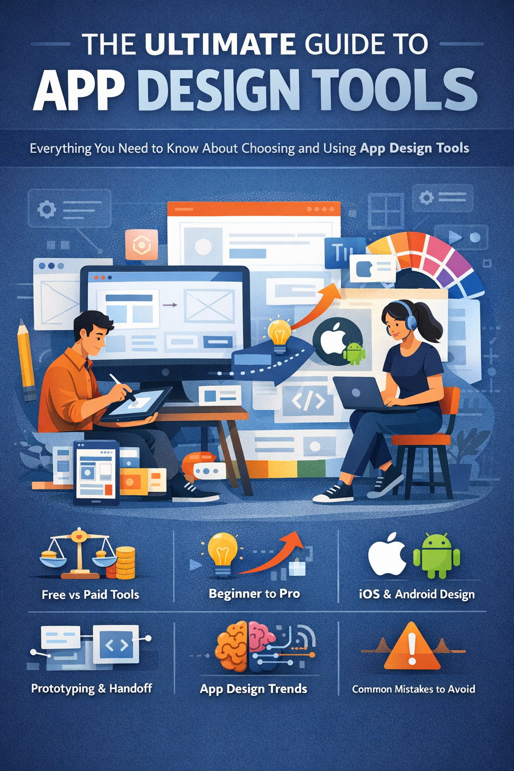
Introduction: Why Understanding App Design Mistakes Matters
When users download an app, they decide whether to keep or delete it in just a few seconds. Research consistently shows that users abandon apps not because of missing features, but because of poor design and frustrating user experiences. This is exactly why understanding what the top mistakes made in app designs are is essential for anyone building digital products.
App design is more than visuals. It includes usability, navigation, accessibility, performance, and user psychology. An app can look beautiful and still fail if it does not feel intuitive or easy to use.
According to UX studies, 88% of users are unlikely to return after a bad experience, and nearly 70% of app uninstall reasons are design-related. These numbers show that app design mistakes are not minor issues. They directly impact retention, revenue, and brand trust.
This in-depth guide explores the top mistakes made in app designs, why they happen, and how to avoid them. It is written for:
- Startup founders
- App designers and UX professionals
- Product managers
- Developers working on mobile or web apps
Why App Design Mistakes Are So Costly
App design mistakes do not just create minor inconveniences. They directly affect user behavior, revenue, and long-term growth. When users struggle to understand or use an app, they rarely give it a second chance. This is why knowing what are the top mistakes made in app designs is critical for reducing risk and improving success.
The Real Cost of Poor App Design
Poor app design leads to measurable business losses. Studies in mobile UX consistently show:
- Over 25% of users abandon an app after just one use
- Apps lose nearly 77% of daily active users within the first 3 days
- Poor usability is one of the top reasons for 1-star app store reviews
Once an app receives negative reviews due to bad design, recovery becomes difficult. App store algorithms factor in ratings, which means poor design can also hurt visibility and discoverability.
How App Design Mistakes Impact Key Business Metrics
| Design Issue | Business Impact |
|---|---|
| Confusing navigation | Lower engagement and higher bounce rates |
| Slow load times | Increased uninstall rates |
| Poor onboarding | Users never reach core features |
| Inconsistent UI | Reduced trust and brand credibility |
| Accessibility issues | Lost users and potential legal risks |
Every one of these problems is tied to common app design mistakes that are preventable with proper planning and testing.
UX vs UI: A Common Source of App Design Mistakes
One of the biggest misunderstandings in app design is confusing UI (User Interface) with UX (User Experience).
- UI focuses on how the app looks (colors, fonts, buttons)
- UX focuses on how the app works and feels
Many apps fail because teams focus heavily on visuals while ignoring usability. An app may look modern, but if users cannot complete basic tasks easily, it fails from a UX perspective.
“Design is not just what it looks like and feels like. Design is how it works.”
— Steve Jobs
This quote perfectly explains why the top mistakes made in app designs are often functional, not visual.
Case Study: How a Small Design Mistake Caused Massive User Drop-Off
A well-known e-commerce app once redesigned its checkout flow to look cleaner. However, they:
- Removed progress indicators
- Hid the “guest checkout” option
- Increased form fields
The result?
- 23% drop in completed purchases
- Spike in abandoned carts
- Thousands of negative reviews mentioning “confusing checkout”
The redesign looked better visually, but it failed users. This is a classic example of how app design mistakes impact real business outcomes.
Why Fixing App Design Mistakes Early Saves Money
Fixing design issues after launch is significantly more expensive than addressing them early. Industry estimates suggest:
- Fixing issues during development costs 10x less than post-launch fixes
- Poor design decisions compound over time as user expectations evolve
Understanding what are the top mistakes made in app designs helps teams:
- Reduce rework
- Improve retention
- Launch with confidence
App design is not just a creative task. It is a strategic business decision.
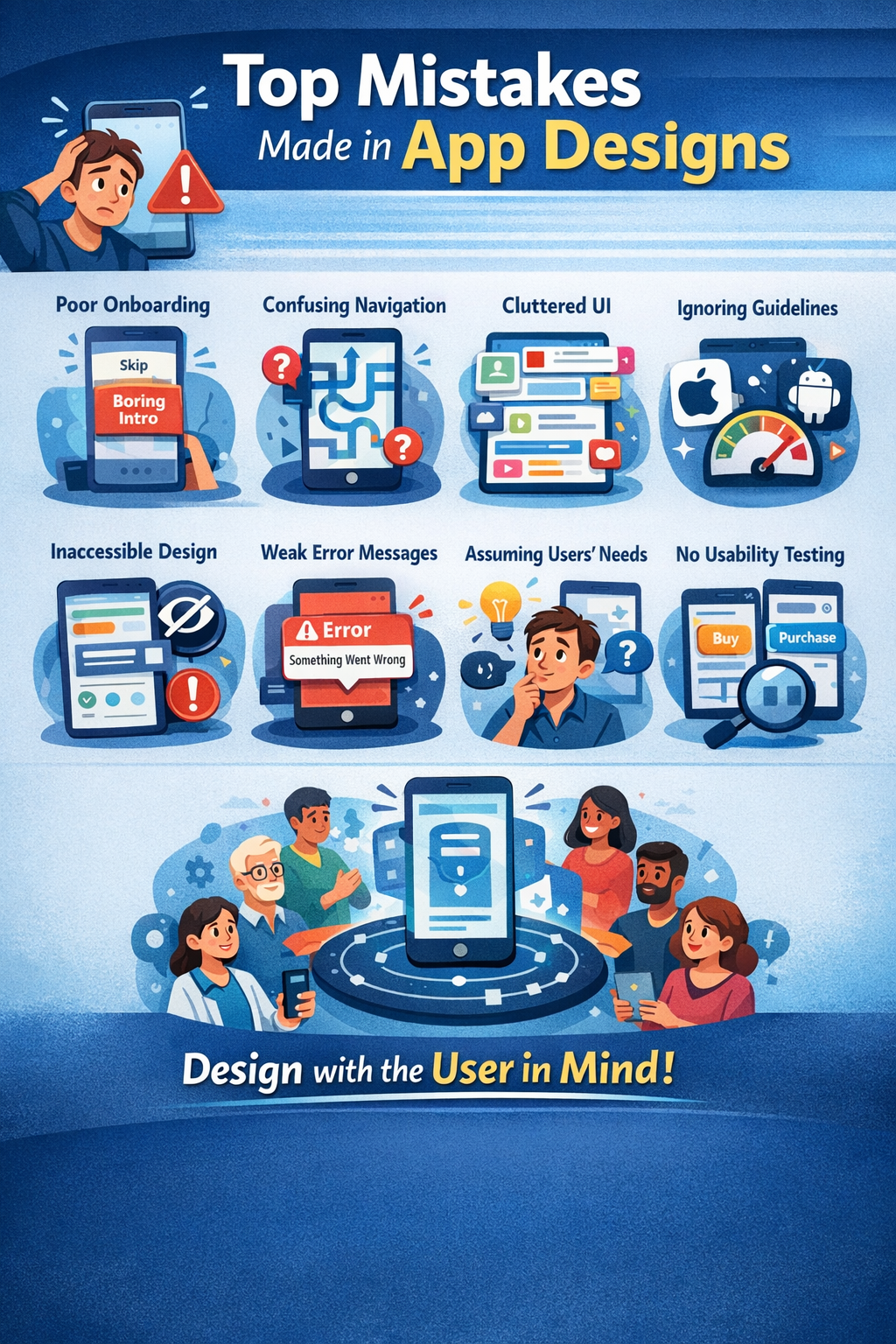
What Are the Top Mistakes Made in App Designs? (Quick Overview)
Before diving deep into each issue, it helps to see the top mistakes made in app designs at a glance. These are the most common problems found in failed or underperforming apps across industries, platforms, and user types.
This section is designed to give you a high-level understanding and also support featured snippet visibility by clearly answering the question: what are the top mistakes made in app designs?
The Top App Design Mistakes at a Glance
- Poor or confusing onboarding experience
- Complicated or unintuitive navigation
- Overcrowded and cluttered user interfaces
- Ignoring iOS and Android design guidelines
- Slow load times and performance-heavy design choices
- Inconsistent visual design and branding
- Poor typography and readability issues
- Lack of accessibility considerations
- Unclear error messages and weak user feedback
- Designing based on assumptions instead of real user data
- Skipping usability testing altogether
Each of these app design mistakes negatively affects usability, retention, and engagement. When multiple mistakes exist in the same app, the impact compounds quickly.
Why These App Design Mistakes Are So Common
Many of the top mistakes made in app designs happen for predictable reasons:
- Teams rush to launch without proper testing
- Designers prioritize aesthetics over usability
- Stakeholders rely on assumptions instead of research
- Development constraints override UX decisions
- Feedback loops are ignored or delayed
In fast-moving product teams, design decisions are often made quickly. Without a structured UX process, small issues turn into major user frustrations.
How These Mistakes Affect Users at Different Stages
| User Stage | Impact of App Design Mistakes |
|---|---|
| First-time users | Confusion, frustration, immediate uninstall |
| Returning users | Reduced engagement and trust |
| Power users | Feature abandonment and negative reviews |
| Accessibility users | Complete inability to use the app |
This is why understanding what are the top mistakes made in app designs is not optional. It affects every type of user differently, but always negatively.
What’s Coming Next
In the next sections, we will break down each app design mistake in detail, including:
- Why it happens
- Real-world examples
- UX principles behind the issue
- Actionable ways to fix and avoid it
We’ll start with one of the most damaging mistakes of all.
Mistake #1 – Poor or Confusing App Onboarding
One of the top mistakes made in app designs is poor onboarding. Onboarding is the user’s first real interaction with your app. If it fails, users rarely stick around long enough to discover the app’s value.
Studies show that nearly 80% of users who uninstall an app do so within the first 3 days. In many cases, the reason is simple: they did not understand how the app works or why it matters to them.
Why App Onboarding Is Critical for User Retention
Good onboarding helps users:
- Understand the app’s core value quickly
- Learn how to complete key actions
- Feel confident using the app without instructions
Poor onboarding does the opposite. It overwhelms users, confuses them, or forces them to work too hard before seeing any benefit.
When discussing what are the top mistakes made in app designs, onboarding consistently ranks at the top because it sets the tone for the entire experience.
Common App Onboarding Design Mistakes
The most frequent onboarding-related app design mistakes include:
- Too many steps before value is shown
Long walkthroughs discourage users from continuing. - Forcing sign-up too early
Users want to explore before committing. - Generic explanations instead of real use cases
Users care about how the app helps them, not abstract features. - No clear next action
Users are left wondering what to do after onboarding ends. - Skipping onboarding entirely
Assuming users will “figure it out” is a costly mistake.
Example: Good vs Bad App Onboarding
| Poor Onboarding | Effective Onboarding |
|---|---|
| 10+ tutorial screens | 2–4 focused steps |
| Feature-heavy explanations | Value-driven messaging |
| Mandatory account creation | Optional sign-up |
| No user guidance | Contextual hints |
Apps like Duolingo and Notion succeed because they:
- Show value immediately
- Use progressive onboarding
- Teach by doing, not explaining
Case Study: How Fixing Onboarding Increased Retention
A SaaS productivity app noticed a 60% drop-off during onboarding. After analyzing user behavior, they:
- Reduced onboarding screens from 7 to 3
- Allowed guest access
- Replaced text explanations with interactive prompts
Results after 30 days:
- 28% increase in day-one retention
- 19% increase in feature adoption
- Significant reduction in uninstall rates
This shows how fixing a single onboarding mistake can dramatically improve app performance.
How to Design Better App Onboarding
To avoid this common app design mistake, follow these best practices:
- Highlight the core value proposition immediately
- Let users experience success early
- Use progressive disclosure instead of full tutorials
- Delay sign-up until trust is built
- Provide contextual help instead of instructions
Rule of thumb: If users can’t understand your app in under 60 seconds, onboarding needs improvement.
Poor onboarding is often the first answer to what are the top mistakes made in app designs, and fixing it delivers fast, measurable results.
Mistake #2 – Complicated or Unintuitive Navigation
Another major answer to what are the top mistakes made in app designs is complicated navigation. Navigation is how users move through your app. If users cannot easily find what they are looking for, the app feels broken, even if all the features exist.
Research shows that users abandon apps when they feel lost. Confusing navigation increases cognitive load, slows task completion, and creates frustration. When users have to “think too much,” they leave.
Why Navigation Is One of the Biggest App UX Mistakes
Good navigation should feel almost invisible. Users should instinctively know:
- Where they are
- Where they can go next
- How to return or undo actions
When navigation fails, users feel uncertain and lose confidence in the app. This makes complicated navigation one of the most damaging app design mistakes.
Signs Your App Navigation Is Confusing
If you are unsure whether your app has navigation issues, watch for these warning signs:
- Users frequently tap the wrong buttons
- Core features are buried in menus
- Icons are unclear or unlabeled
- Too many navigation styles are used at once
- Users rely heavily on search instead of browsing
Analytics often reveal these problems through:
- High bounce rates
- Low feature discovery
- Repeated back-and-forth actions
Common Navigation Design Mistakes in Apps
The most common navigation-related app design mistakes include:
- Too many menu items
Users feel overwhelmed by choices. - Hidden navigation elements
Critical features are placed behind gestures or long menus. - Inconsistent navigation patterns
Tabs, drawers, and buttons behave differently across screens. - Non-standard icons
Creative icons confuse users when they lack labels.
Table: Good vs Bad App Navigation
| Poor Navigation Design | Effective Navigation Design |
|---|---|
| Deep menu structures | Flat, simple hierarchy |
| Unlabeled icons | Icons with clear labels |
| Multiple navigation systems | One consistent system |
| Hidden core features | Easily accessible features |
Apps like Spotify and Instagram succeed because their navigation:
- Is predictable
- Follows platform conventions
- Prioritizes core actions
Case Study: Navigation Redesign That Improved Engagement
A finance app noticed users rarely accessed its budgeting tools. After usability testing, they found the feature was buried three levels deep.
The team redesigned navigation by:
- Moving the budgeting feature to the main tab bar
- Renaming menu labels using user language
- Reducing menu items by 40%
Results:
- 34% increase in feature usage
- 22% longer session times
- Fewer support tickets related to “missing features”
This example highlights how navigation mistakes often hide value rather than remove it.
Best Practices for Simple and Intuitive App Navigation
To avoid this common app design mistake:
- Limit primary navigation to 3–5 key options
- Follow iOS and Android navigation guidelines
- Use familiar icons and labels
- Keep navigation consistent across screens
- Test navigation with real users early
Good navigation doesn’t explain itself. It simply works.
Complicated navigation is one of the clearest answers to what are the top mistakes made in app designs, and fixing it dramatically improves usability.
Mistake #3 – Overcrowded and Cluttered User Interfaces
An overcrowded interface is one of the most visible answers to what are the top mistakes made in app designs. When too many elements compete for attention, users feel overwhelmed and unsure of what to do next.
Cluttered app design increases cognitive load, meaning users must spend more mental effort just to understand the screen. This often leads to frustration, slower task completion, and app abandonment.
Why Minimalism Matters in App Design
Minimalism is not about removing features. It is about presenting only what the user needs at the right moment. Clean interfaces help users:
- Focus on primary actions
- Scan content faster
- Make decisions with confidence
Studies in UX psychology show that users perform tasks faster and with fewer errors in simplified interfaces. This makes clutter one of the most damaging app design mistakes.
Common UI Clutter Issues in Mobile Apps
The most common clutter-related app design mistakes include:
- Too many buttons on a single screen
- Excessive text instead of scannable content
- Multiple competing call-to-action buttons
- Decorative elements with no functional purpose
- Overuse of colors, gradients, or shadows
Each of these issues pulls attention away from what matters most.
How Clutter Affects Usability and Conversions
| Clutter Issue | User Impact |
|---|---|
| Too many options | Decision fatigue |
| Visual noise | Slower comprehension |
| Poor spacing | Accidental taps |
| Competing CTAs | Lower conversion rates |
In e-commerce and SaaS apps, clutter often leads to missed conversions because users hesitate or choose the wrong action.
Case Study: Simplifying UI Increased Conversions
An online booking app tested two versions of its home screen:
- Version A: 12 buttons, multiple banners, long text
- Version B: 4 primary actions, more white space, concise copy
Results after A/B testing:
- 21% increase in completed bookings
- 17% decrease in time-to-task completion
- Higher satisfaction ratings in user feedback
This case shows how removing elements can actually improve performance.
How to Simplify App UI Without Losing Functionality
To avoid clutter while keeping features accessible:
- Prioritize one primary action per screen
- Use progressive disclosure for advanced features
- Replace long text with icons and short labels
- Increase white space and consistent spacing
- Regularly audit screens and remove unused elements
If everything is important, nothing is important.
Overcrowded interfaces remain one of the top mistakes made in app designs, especially as apps add more features over time.
Mistake #4 – Ignoring Platform Design Guidelines
Ignoring platform-specific design guidelines is another common answer to what are the top mistakes made in app designs. Users come to apps with pre-existing expectations based on the platform they are using. When an app breaks those expectations, it feels confusing and untrustworthy.
Both Apple (iOS) and Google (Android) provide detailed human interface guidelines for a reason. These guidelines are built on years of user behavior research and usability testing.
Why Platform Design Guidelines Matter
Platform guidelines help ensure that:
- Navigation patterns feel familiar
- Gestures behave as users expect
- UI components are consistent with the operating system
- Accessibility standards are met
When apps ignore these rules, users must relearn basic interactions, which increases frustration and errors.
Common App Design Mistakes When Ignoring Guidelines
Many teams unintentionally introduce app design mistakes by:
- Using custom gestures that conflict with system gestures
- Placing navigation elements in non-standard locations
- Copying iOS design patterns into Android apps (and vice versa)
- Replacing native components with custom ones that behave differently
These issues make the app feel “off,” even if users can’t immediately explain why.
iOS vs Android: Key Design Differences Designers Ignore
| Design Element | iOS Expectation | Android Expectation |
|---|---|---|
| Navigation | Bottom tabs | Bottom nav + back button |
| Gestures | Swipe-based interactions | System back navigation |
| Typography | San Francisco font | Roboto / Material |
| UI Feel | Clean and minimal | Functional and flexible |
When apps fail to respect these differences, users experience unnecessary friction.
Case Study: Platform-Specific Redesign Improved Ratings
A fitness app launched with a single design across iOS and Android. Android users complained about:
- Missing back button support
- Non-standard navigation gestures
After redesigning the Android app using Material Design guidelines, the app saw:
- A 1.2-star increase in Play Store ratings
- Fewer negative reviews mentioning usability
- Higher retention among Android users
This demonstrates how following platform standards directly affects user satisfaction.
Best Practices for Following Platform Guidelines
To avoid this app design mistake:
- Design separate UI systems for iOS and Android
- Use native components whenever possible
- Respect system gestures and navigation rules
- Review Apple’s Human Interface Guidelines and Google’s Material Design regularly
Familiarity builds trust. Consistency builds usability.
Ignoring platform guidelines remains one of the top mistakes made in app designs, especially for cross-platform apps trying to move too fast.
Mistake #5 – Slow Load Times and Poor Performance
Slow performance is one of the most frustrating answers to what are the top mistakes made in app designs. Users expect apps to be fast. When screens take too long to load or interactions lag, users lose patience almost instantly.
Performance is not just a technical issue. It is a design responsibility as well. Many app design mistakes directly contribute to slow load times and poor responsiveness.
Why Performance Is a Core Part of App Design
Modern users expect:
- Screens to load in under 2 seconds
- Immediate feedback after taps
- Smooth animations without stuttering
Research shows that:
- A 1-second delay can reduce conversions by up to 7%
- 53% of users abandon apps that take too long to load
When performance fails, even well-designed apps feel broken.
Design Choices That Hurt App Performance
Some of the most common design-related performance mistakes include:
- Large, uncompressed images
- Heavy animations on every interaction
- Complex transitions between screens
- Loading too much content at once
- Custom UI elements that replace optimized native components
These choices may look impressive during demos, but they often fail under real-world conditions.
Table: Design Decisions vs Performance Impact
| Design Choice | Performance Impact |
|---|---|
| High-resolution images | Longer load times |
| Excessive animations | Lag and stuttering |
| Full-page data loads | Slow initial screens |
| Non-native UI elements | Increased processing |
Designers must balance aesthetics with speed.
Case Study: Performance-First Redesign Reduced Uninstalls
A news app struggled with high uninstall rates. User feedback consistently mentioned:
- Slow article loading
- Janky scrolling
After auditing design assets, the team:
- Compressed images
- Reduced animation duration
- Introduced skeleton loading states
Results:
- 31% reduction in app uninstalls
- Faster perceived load times
- Higher engagement per session
This shows how performance-focused design directly improves user retention.
How Designers Can Improve App Performance Early
To avoid this app design mistake:
- Optimize images before development
- Use animations sparingly and purposefully
- Design loading states to manage expectations
- Avoid loading non-essential content upfront
- Collaborate closely with developers early
Speed is a feature. Performance is part of UX.
Slow performance remains one of the top mistakes made in app designs, and fixing it requires design and development alignment.
Mistake #6 – Inconsistent Visual Design and Branding
Inconsistent visual design is one of the most overlooked answers to what are the top mistakes made in app designs. When an app looks and behaves differently from screen to screen, users lose trust and confidence. Even small inconsistencies can make an app feel unprofessional or unreliable.
Consistency helps users learn how an app works. Once users understand one pattern, they expect it to work the same way everywhere.
What Design Inconsistency Looks Like in Apps
Inconsistent design can appear in many subtle ways, including:
- Different button styles across screens
- Changing font sizes or colors without purpose
- Inconsistent spacing and alignment
- Varying icon styles
- Different interactions for the same action
These inconsistencies increase cognitive load and slow down user interactions.
Common Consistency-Related App Design Mistakes
The most frequent mistakes include:
- Designing screens in isolation instead of as a system
- Allowing multiple designers to create without shared guidelines
- Making quick UI changes without updating other screens
- Failing to document design decisions
When teams move fast, consistency is often sacrificed.
Why Visual Consistency Improves Usability
Consistent design:
- Reduces learning time
- Builds brand recognition
- Increases user confidence
- Improves accessibility
According to UX research, users complete tasks faster in consistent interfaces because they do not need to relearn interactions.
Case Study: Design System Improved App Quality
A growing SaaS app suffered from inconsistent UI after rapid feature releases. The team introduced a design system that included:
- Standardized colors and typography
- Reusable components
- Clear spacing rules
Results within 3 months:
- Faster design and development cycles
- Fewer UI bugs
- Improved user satisfaction scores
This shows how consistency directly affects both UX and team efficiency.
How to Maintain Consistent Visual Design
To avoid this app design mistake:
- Create and maintain a design system
- Use reusable components
- Document design standards
- Regularly audit the UI for inconsistencies
- Align design and development teams
Consistency turns complexity into familiarity.
Inconsistent visual design remains one of the top mistakes made in app designs, especially in fast-growing products.
Mistake #7 – Poor Readability and Typography Choices
Poor typography is a subtle but powerful answer to what are the top mistakes made in app designs. Users spend most of their time reading, scanning, and interpreting text. When text is hard to read, the entire app experience suffers.
Typography affects usability, accessibility, and perceived quality. Even the best features lose value if users struggle to read instructions, labels, or content.
Why Typography Is Critical in App Design
Good typography helps users:
- Scan content quickly
- Understand hierarchy and importance
- Reduce eye strain
- Complete tasks with fewer errors
Studies show that readable text improves comprehension and task success, especially on small mobile screens.
Common Typography Mistakes in App Designs
Some of the most frequent text-related app design mistakes include:
- Font sizes that are too small
- Low contrast between text and background
- Using too many font styles or weights
- Long blocks of text without spacing
- Poor line height and letter spacing
These mistakes make apps feel tiring and difficult to use.
Table: Bad vs Good Typography Practices
| Poor Typography | Effective Typography |
|---|---|
| Small text sizes | Legible, scalable text |
| Low contrast colors | High contrast for readability |
| Multiple fonts | One or two font families |
| Dense paragraphs | Short, scannable text |
Accessibility and Typography Go Hand in Hand
Typography directly impacts accessibility. Users with:
- Visual impairments
- Dyslexia
- Color blindness
are especially affected by poor text choices. Accessibility guidelines recommend:
- Minimum font sizes
- High contrast ratios
- Support for dynamic text resizing
Ignoring these rules is one of the most harmful app design mistakes.
Case Study: Typography Redesign Reduced User Errors
A finance app received complaints about users misreading balances. The design team:
- Increased font size
- Improved contrast
- Simplified number formatting
Results:
- Fewer user errors
- Increased trust in displayed data
- Higher satisfaction ratings
Best Practices for App Typography
To avoid this common app design mistake:
- Use readable system fonts
- Maintain strong contrast
- Limit font styles and weights
- Break text into short sections
- Test text readability on real devices
If users struggle to read, they struggle to use the app.
Poor readability remains one of the top mistakes made in app designs, and fixing typography often delivers immediate UX improvements.
Mistake #8 – Not Designing for Accessibility
Failing to design for accessibility is one of the most serious answers to what are the top mistakes made in app designs. Accessibility ensures that all users, including those with disabilities, can use an app effectively. When accessibility is ignored, apps exclude a large portion of potential users.
According to the World Health Organization, over 1 billion people live with some form of disability. Many accessibility improvements also improve usability for everyone, not just users with special needs.
What Accessibility Means in App Design
Accessibility in app design includes:
- Visual accessibility (contrast, text size)
- Motor accessibility (tap targets, gestures)
- Cognitive accessibility (clarity and simplicity)
- Assistive technology support (screen readers)
Good accessibility design makes apps more inclusive and easier to use.
Common Accessibility Mistakes in Apps
Some of the most frequent accessibility-related app design mistakes include:
- Low color contrast between text and background
- Tap targets that are too small
- No support for screen readers
- Relying on color alone to convey meaning
- Complex gestures with no alternatives
These mistakes often prevent users from completing basic tasks.
Table: Accessibility Issues and Their Impact
| Accessibility Issue | User Impact |
|---|---|
| Low contrast | Hard-to-read content |
| Small buttons | Accidental taps |
| No screen reader support | App unusable |
| Color-only indicators | Confusion for color-blind users |
Case Study: Accessibility Improvements Boosted Engagement
A travel app redesigned its interface to meet accessibility standards by:
- Increasing contrast ratios
- Enlarging tap targets
- Adding screen reader labels
Results after launch:
- Increased engagement from older users
- Fewer usability complaints
- Improved app store ratings
This shows that accessibility benefits a wide range of users.
Why Accessibility Improves UX for Everyone
Accessible design:
- Improves readability
- Reduces user errors
- Enhances usability in poor lighting or noisy environments
- Makes apps easier to navigate
Accessibility is not an edge case. It is a core part of good UX.
How to Design More Accessible Apps
To avoid this app design mistake:
- Follow WCAG accessibility guidelines
- Test color contrast and text size
- Support screen readers and dynamic text
- Design large, clear touch targets
- Provide alternatives to complex gestures
Accessible design is good design.
Ignoring accessibility remains one of the top mistakes made in app designs, but it is also one of the easiest to fix with awareness and testing.
Mistake #9 – Poor Error Messages and Feedback
Poor error handling and weak user feedback are often overlooked, yet they are a major part of what are the top mistakes made in app designs. Errors are unavoidable in apps. What matters is how clearly and helpfully the app responds when something goes wrong.
When users encounter vague or confusing error messages, they feel frustrated, blame themselves, or assume the app is broken.
Why User Feedback Is Essential in App Design
Good feedback helps users:
- Understand what just happened
- Know whether an action was successful
- Learn how to fix errors
- Feel in control of the app
Without clear feedback, users feel lost and uncertain.
Common Error-Handling Mistakes in Apps
The most frequent error-related app design mistakes include:
- Generic error messages like “Something went wrong”
- No explanation of what caused the error
- No guidance on how to fix the issue
- Silent failures with no feedback
- Overly technical language
These messages increase anxiety and reduce trust.
Table: Bad vs Good Error Messages
| Bad Error Message | Better Error Message |
|---|---|
| “Error occurred” | “Payment failed. Please check your card details.” |
| “Invalid input” | “Email address is missing ‘@’.” |
| No feedback | “Your changes were saved successfully.” |
Clear messaging turns frustration into understanding.
Case Study: Improved Error Messages Reduced Support Requests
A banking app analyzed customer support tickets and found many were caused by unclear error messages. The team:
- Rewrote error copy in plain language
- Added suggestions for next steps
- Highlighted error fields visually
Results:
- 26% reduction in support tickets
- Higher task completion rates
- Improved user confidence
The Role of Feedback Beyond Errors
Feedback is not just for mistakes. Good apps provide feedback for:
- Successful actions
- Loading states
- Long processes
- Disabled actions
Visual cues like progress indicators and confirmations reassure users that the app is working.
Best Practices for Designing Better Error States
To avoid this app design mistake:
- Explain what went wrong in simple terms
- Tell users how to fix the problem
- Avoid blaming language
- Provide visual cues alongside text
- Test error states like primary flows
Errors are moments of truth in UX. Handle them with care.
Poor error messages and feedback are among the top mistakes made in app designs, but fixing them significantly improves user trust and satisfaction.
Mistake #10 – Designing for Assumptions Instead of Real Users
Designing based on assumptions rather than real user behavior is one of the most damaging answers to what are the top mistakes made in app designs. Many apps fail not because of technical issues, but because they are built around what teams think users want, instead of what users actually need.
Assumptions lead to features no one uses, confusing workflows, and missed opportunities to solve real problems.
Why User Research Matters in App Design
User research helps teams:
- Understand real pain points
- Validate ideas before building
- Identify usability issues early
- Reduce costly redesigns
Without research, design decisions are based on opinions, not evidence.
Common Assumptions Designers Make
Some frequent assumption-based app design mistakes include:
- “Users will figure it out on their own”
- “This feature is obvious”
- “Our users are just like us”
- “More features mean more value”
These assumptions often lead to bloated, confusing apps.
Table: Assumptions vs Reality
| Assumption | Reality |
|---|---|
| Users read instructions | Users skim or skip |
| Users explore menus | Users expect guidance |
| Users want more features | Users want simplicity |
| Users adapt quickly | Users prefer familiarity |
Designing for reality leads to better outcomes.
Case Study: User Research Changed App Direction
A health app assumed users wanted detailed tracking dashboards. After conducting interviews, they discovered users mainly wanted:
- Simple daily reminders
- Clear progress summaries
The team redesigned the app around these insights and saw:
- Increased daily engagement
- Lower churn rates
- Better app store reviews
How to Gather Real User Feedback
To avoid this app design mistake:
- Conduct user interviews
- Observe users completing tasks
- Analyze in-app behavior and analytics
- Collect feedback through surveys
- Run usability tests early and often
Even small research efforts uncover valuable insights.
User-Centered Design Prevents Costly Mistakes
User-centered design ensures that:
- Features solve real problems
- Workflows match user expectations
- Apps feel intuitive and purposeful
You are not the user. Design for reality, not assumptions.
Designing for assumptions remains one of the top mistakes made in app designs, but it is also one of the easiest to fix with proper research.
Mistake #11 – Skipping Usability Testing
Skipping usability testing is one of the most common and expensive answers to what are the top mistakes made in app designs. Many teams assume that if an app looks good and works technically, users will have no problems. In reality, design flaws are often invisible to the people who built the app.
Usability testing reveals how real users interact with your app, where they struggle, and why they abandon tasks.
What Is Usability Testing in App Design?
Usability testing involves observing real users as they:
- Navigate the app
- Complete common tasks
- React to design choices
The goal is to identify friction points, confusion, and unmet expectations before they impact large numbers of users.
Why Skipping Testing Leads to Design Failure
When usability testing is skipped:
- Small issues go unnoticed
- Confusion becomes frustration
- Support requests increase
- Negative reviews multiply
Many of the top mistakes made in app designs could have been caught with even minimal testing.
Types of Usability Testing for Apps
| Testing Type | Purpose |
|---|---|
| Moderated testing | Observe user behavior in real time |
| Unmoderated testing | Test at scale with recorded sessions |
| A/B testing | Compare design variations |
| Guerrilla testing | Quick feedback from random users |
| Accessibility testing | Ensure inclusive design |
Each type provides unique insights.
Case Study: Early Testing Prevented Costly Redesign
A startup tested its app with just five users before launch. They discovered:
- Users misunderstood a core feature
- Navigation labels were unclear
The team fixed these issues before release and avoided:
- Major redesign costs
- Negative first impressions
- Poor app store ratings
This aligns with UX research showing that testing with 5 users can uncover up to 85% of usability issues.
When and How Often to Test App Designs
Usability testing should happen:
- Before development
- During prototyping
- After major updates
- On an ongoing basis
Testing is not a one-time activity. User behavior evolves over time.
How to Start Usability Testing Easily
To avoid this app design mistake:
- Test with real users, not team members
- Focus on key user flows
- Observe silently and take notes
- Act on feedback quickly
Testing does not slow you down. It prevents failure.
Skipping usability testing remains one of the top mistakes made in app designs, but it is entirely preventable with simple processes.
Common App Design Mistakes Startups Make vs Enterprises
While what are the top mistakes made in app designs applies to all teams, the type of mistakes often differs between startups and large enterprises. Team size, resources, and priorities heavily influence design decisions.
Understanding these differences helps teams avoid repeating common patterns.
App Design Mistakes Common in Startups
Startups often move fast with limited resources. While speed is valuable, it leads to several design-related risks:
- Rushing to launch without validation
- Skipping usability testing to save time
- Overloading apps with features to compete
- Inconsistent UI due to rapid changes
- Designing for founders instead of users
Startups often assume they can “fix it later,” but early design mistakes shape user perception permanently.
App Design Mistakes Common in Enterprises
Large organizations face different challenges:
- Overly complex workflows driven by internal processes
- Too many stakeholders influencing design
- Outdated design systems
- Slow iteration cycles
- Poor alignment between teams
Enterprise apps often suffer from usability issues because decisions prioritize internal needs over user experience.
Table: Startup vs Enterprise App Design Mistakes
| Area | Startups | Enterprises |
|---|---|---|
| Speed | Too fast, little testing | Too slow, heavy processes |
| Features | Feature overload | Feature bloat |
| Design consistency | Inconsistent UI | Rigid but outdated UI |
| User research | Minimal | Rare or delayed |
Despite differences, both face the same risk: ignoring the user.
Case Insight: Different Teams, Same Outcome
A startup app failed due to rushed onboarding.
An enterprise app failed due to overly complex workflows.
Different causes, same result: users left.
This highlights why understanding what are the top mistakes made in app designs matters at every company size.
How Teams Can Avoid These Mistakes
Regardless of team size:
- Prioritize user needs
- Validate decisions with data
- Maintain design systems
- Test early and often
Good design scales. Bad design multiplies problems.
How to Avoid the Top Mistakes Made in App Designs
Understanding what are the top mistakes made in app designs is only valuable if teams know how to prevent them. Avoiding these mistakes requires a structured, user-centered approach that balances speed, usability, and long-term scalability.
Below is a clear, practical framework that successful teams follow to reduce app design risk.
A Step-by-Step Process to Avoid App Design Mistakes
1. Start With User Research
User research helps teams understand real problems before designing solutions.
- Conduct interviews
- Observe user behavior
- Identify pain points
Design decisions should be evidence-based, not assumption-driven.
2. Create Wireframes Before Visual Design
Wireframes allow teams to:
- Test layouts early
- Validate navigation logic
- Identify usability issues before development
Low-fidelity wireframes save time and money.
3. Follow Platform Design Guidelines
Respecting iOS and Android standards ensures:
- Familiar interactions
- Reduced learning curves
- Better accessibility
Platform guidelines exist to prevent common app design mistakes.
4. Test Early and Often
Usability testing should be continuous, not a final step.
- Test prototypes
- Test live features
- Test updates
Early testing catches problems when they are easiest to fix.
5. Prioritize Performance and Accessibility
Design with real-world conditions in mind:
- Optimize assets
- Reduce unnecessary animations
- Ensure readable text and large tap targets
Performance and accessibility are part of good UX.
6. Iterate Based on Real Data
Use analytics and feedback to improve:
- Track drop-off points
- Monitor feature usage
- Respond to user reviews
Iteration prevents small issues from becoming major failures.
Table: Prevention Strategy vs Benefit
| Strategy | Benefit |
|---|---|
| User research | Fewer assumptions |
| Wireframing | Faster iteration |
| Testing | Reduced risk |
| Design systems | Consistency |
| Accessibility | Broader reach |
Key Principle to Remember
Good app design is not about perfection. It’s about continuous improvement.
Teams that actively work to avoid the top mistakes made in app designs consistently deliver better user experiences and stronger business results.
App Design Checklist (Before Launch)
Before releasing an app, teams should run through a final checklist to catch common issues. Many of the answers to what are the top mistakes made in app designs can be prevented by reviewing core UX, UI, and performance factors before launch.
This checklist helps ensure your app is usable, accessible, and ready for real users.
Pre-Launch App Design Checklist
Navigation & Structure
- Core features are easy to find
- Navigation is consistent across screens
- Users can easily go back or undo actions
Onboarding Experience
- Onboarding clearly explains the app’s value
- Users can start using the app quickly
- Sign-up is optional or delayed
Visual Design & Consistency
- Fonts, colors, and buttons are consistent
- Design follows platform guidelines
- Visual hierarchy is clear
Performance & Load Times
- Images are optimized
- Animations are purposeful and minimal
- Loading states are implemented
Readability & Accessibility
- Text is readable on all screen sizes
- Color contrast meets accessibility standards
- Tap targets are large enough
- Screen readers are supported
Error Handling & Feedback
- Error messages are clear and helpful
- Success actions provide confirmation
- Users understand how to fix mistakes
Usability Testing
- App tested with real users
- Key flows validated
- Accessibility testing completed
Table: Checklist Area vs Risk If Ignored
| Area | Risk |
|---|---|
| Navigation | User confusion |
| Onboarding | Early abandonment |
| Performance | High uninstall rates |
| Accessibility | Excluded users |
| Error handling | Support overload |
Why This Checklist Matters
Skipping these checks leads directly to the top mistakes made in app designs. Reviewing this checklist before launch reduces:
- Negative reviews
- Costly redesigns
- User churn
Launch readiness is about user readiness, not feature completeness.
Frequently Asked Questions About App Design Mistakes
This section directly answers common questions people search for when trying to understand what are the top mistakes made in app designs. These concise answers are optimized for clarity, scannability, and featured snippets.
What Is the Most Common App Design Mistake?
The most common app design mistake is poor onboarding. If users do not understand how the app works or why it is valuable within the first minute, they are likely to uninstall it.
How Do Bad App Designs Affect User Retention?
Bad app designs increase:
- Confusion
- Frustration
- Task failure
As a result, users abandon the app quickly and are less likely to return. Poor design directly leads to low retention and negative reviews.
Can Good UI Fix Bad UX?
No. Good UI cannot fix bad UX. An app may look visually appealing, but if it is hard to use, slow, or confusing, users will still leave. UX focuses on how the app works, not just how it looks.
How Often Should App Designs Be Updated?
App designs should be reviewed regularly. Most successful apps:
- Continuously test user behavior
- Improve designs based on data
- Update UI patterns as platforms evolve
Design is an ongoing process, not a one-time task.
Are App Design Mistakes Different for Mobile vs Web Apps?
Yes. While principles overlap, mobile apps face unique challenges:
- Smaller screens
- Touch-based interactions
- Performance constraints
Ignoring these differences leads to platform-specific app design mistakes.
Conclusion: Avoiding the Top App Design Mistakes Leads to Better Apps
Understanding what are the top mistakes made in app designs is one of the most important steps toward building successful digital products. Most app failures are not caused by a lack of features or innovation, but by avoidable design decisions that frustrate users and push them away.
Throughout this guide, we covered the most common app design mistakes, including:
- Poor onboarding experiences
- Confusing navigation
- Cluttered interfaces
- Ignoring platform guidelines
- Slow performance
- Inconsistent design
- Poor readability and accessibility
- Weak error handling
- Designing for assumptions instead of real users
- Skipping usability testing
Each of these mistakes negatively impacts usability, retention, trust, and revenue.
The Key Takeaway
Great app design is not about being flashy or trendy. It is about:
- Solving real user problems
- Making interactions simple and intuitive
- Testing continuously
- Improving based on real data
Apps that succeed are built with users at the center of every decision.
Final Advice for App Designers and Product Teams
To consistently avoid the top mistakes made in app designs:
- Listen to users early and often
- Design for clarity, not complexity
- Follow platform standards
- Test before and after launch
- Treat design as an ongoing process
The best apps don’t just work — they feel effortless.
By applying the principles in this guide, teams can build apps that users trust, enjoy, and return to again and again.
👍